Colour Theory Basics
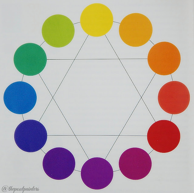
Primary, Secondary and Tertiary Colours:
 |
| Colour Wheel - Color by Betty Edward |
This is probably elementary school stuff and you all must already know there are three primary colours:
Primary colours are those which are what you need, along with white and black, to create literally ANY colour in the world. Primary colours are basically the parent colours and cannot be created by mixing any colour; you have to have them to create any other hue (colour)! Yellow is the lightest warm primary, Red is a medium, very warm primary and Blue is the dark very cool primary colour.
Mixing any two primary colours gives you a secondary colour. These are also three in total:
- Orange (Yellow + Red),
- Violet (Red + Blue) and,
- Green (Yellow + Blue).
There are six tertiary colours which are created by mixing one primary and one secondary colour and are named with the primary parent mentioned first:
- Yellow–Orange (Yellow + Yellow + Red)
- Red–Orange (Red + Red + Yellow),
- Red–Violet (Red + Red + Blue) ,
- Blue–Violet (Blue + Blue + Red),
- Blue–Green (Blue + Blue + Yellow) and,
- Yellow–Green (Yellow + Yellow + Blue).
Yellow–Orange is two parts yellow and one part red hence it leans more towards Yellow. Similarly, Red–Orange is two parts Red and one part Yellow hence leans more towards Red! Add one colour in a bit more quantity and it overtakes the hue.
You can also understand it like this, the Orange in Yellow–Orange is itself made from Yellow and Red. So adding a bit more Yellow to it gives us Yellow–Orange. Similarly the Green in Yellow–Green is made up of Yellow and Blue, adding a bit more Yellow to it creates the Yellow–Green hue.
Analogous and Complementary Colours:
 |
| Colour Wheel - Color by Betty Edward |
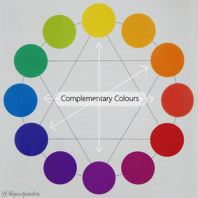
Complementary colours are not the same as complimentary colours. Complementary colours mean the ones that complete each other. In other words, mixing any two complementary colours neutralises (cancels) the hue. They are any two colours exactly opposite each other on the colour wheel. Yellow and Violet are complements, Orange and Blue are complements; similarly Red-Violet and Yellow-Green are complements. The complement of a primary colour is a secondary colour and that of a tertiary colour is a tertiary colour.
Have you ever looked at two colours and thought to yourself, ‘these two go so well together!’
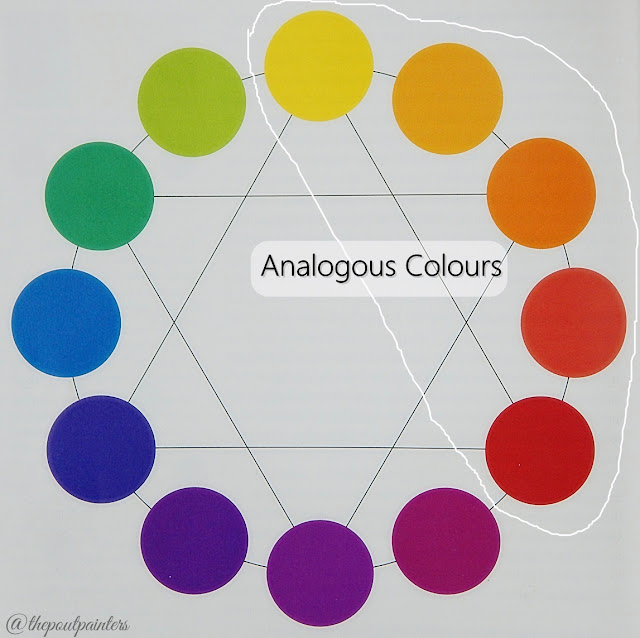
Analogous colours are the ones lying next to each other on the colour wheel such as Yellow, Yellow-Orange, Orange, Red-Orange and Red. Analogous colours may be any three, four or at the most five colours lying next to each other on the colour wheel, but not more than five!
 |
| Colour Wheel - Color by Betty Edward |
Notice how, if we added Red-Violet to the above mentioned group of analogous colours, it looks out of proportion? Red-Violet involves Blue which is opposite Yellow (complementary!) and contradicts the actual definition of analogous colours.
Do you see what I mean?
What Do We Get By Mixing The Three Primary Colours?
A brown.
Any two complementary colours when added give a brown hue or a type of brown hue.
 |
| Book - Color by Betty Edward |
The logic behind mixing complements and getting a brown hue and getting the similar result by mixing three primary colours is because any two complementary colours, when broken down into their parent colours, give you a complete set of primary colours.
I hope I am making sense without making things sound complicated!
Let’s take Yellow and Violet for example. What is Violet made up of? A Red and a Blue! So basically when you mix Yellow and Violet, you are actually mixing Yellow and an already mixed hue of Red and Blue. Similarly, two tertiary complements such as Red-Orange and Blue-Green also boil down to three primaries.
It always boils down to the three parent colours!
Hue, Values and Intensities:
All the colours we see around are manipulated from any of the 12 colours (primaries, secondaries and tertiaries) on the colour wheel. These are called hues, the 12 hues on a colour wheel from which every other colour evolves.
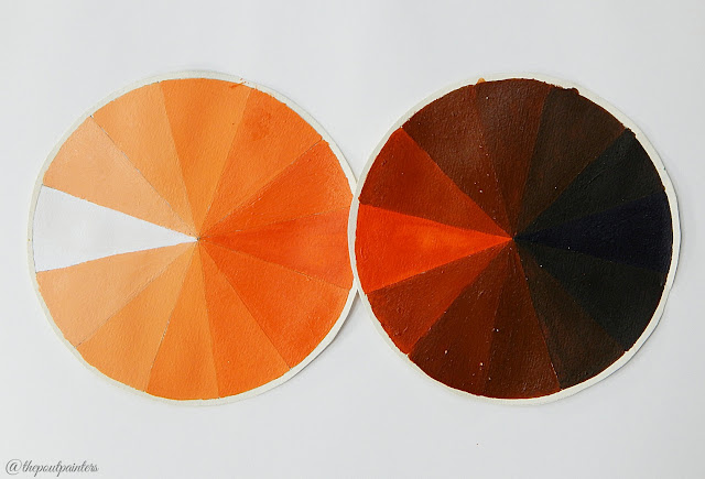
Value is the lightness or darkness of any hue relative to a gray scale from white to black. Values are manipulated by adding white - to increase a colour’s value, or black – to decrease a colour’s value.
 |
| Value Scale - Color by Betty Edward |
 |
| Book - Color by Betty Edward |
 |
| Value Wheel - Ultramarine Blue |
 |
| Value Wheel - Crimson Red |
 |
| Value Wheel - Vermilion Red |
Intensity is the dullness or the brightness of any hue relative to another 7 tier scale from pure colour to colour so dull you cannot discern it at all. Intensity of a hue is changed by adding its complement colour to it.
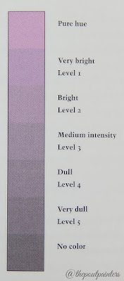 |
| Intensity Scale - Color by Betty Edwards |
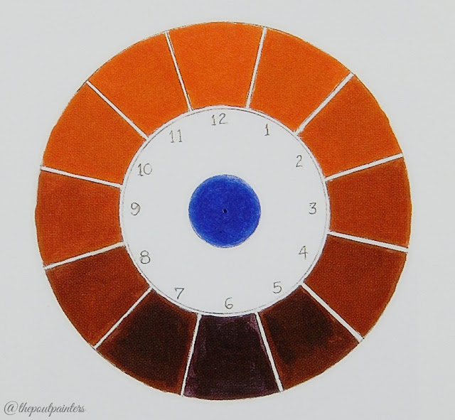 |
| Intensity Wheel of Orange - Color by Betty Edwards |
 |
| Neutralisation of Yellow and Orange With Blue |
I think this term needs to be explained a little bit more. Dullness and brightness actually means how intensely the colour is showing itself. Pure hue will have no amount of its complement added to it, as you start adding the complementary colour it starts losing the intensity and a point reaches when the complement completely neutralises the hue and you cannot discern any hue at all!
Colour Theory Applied To Foundations
The colour theory applied to makeup varies from the one a painter applies on a white/off-white canvas and rightly so, your skin is not a white/off-white canvas.
It’s a living, breathing, coloured organ!
Nevertheless, the core principles remain the same and can be used to learn about the skin and foundations as well.
Believe or not, human skin is made up of reds, yellows, blues and greens mixed in various proportions. Each one of us has our own special proportion of colours to our skin which makes us all different hence unique.
Remember I said every colour you see around somehow goes back to one of the 12 colours on the wheel?
So, what do you think is the source hue for your skin?
Forget about the undertones for now. Just try and take a guess.
Let me help you through the process.
Yellow to Red part of the colour wheel (we will treat Yellow-Green and Green are the as exceptions here) is the obvious warm part and what I like to call the living half of the wheel. Violet to Blue part is the obvious cool part and what I like to call the non-living or better yet, dead half of the colour wheel.
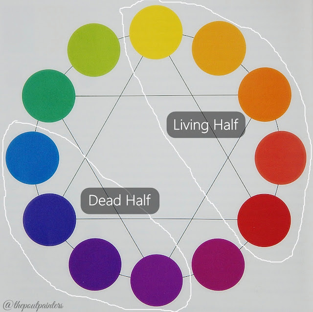 |
| Colour Wheel - Color by Betty Edwards |
I have totally made this up. This might sound lame but will get my point across.
What colour is the Sun? Is it warm? It is associated with life?
What colour is the fire? Is it warm?
Why are Zombies blue and purple? Are they associated with death?
What colour is ice associated to? Why do living beings turn cold when dead?
Can you now limit the source hue choice for your skin from the wheel?
It should be any one hue from the living half of the wheel, should not it?
It’s Yellow-Orange.
All the skin tones are manipulated from this one source hue.
 |
| Lighter Value Wheels of Yellow-Orange |
Skin Tones & Undertones:
The two are very different terms and should not be used interchangeably. I understand it could be difficult for a novice in makeup to differentiate the two.
Yellow-Orange on its own is extremely bright to blend in with any skin tone and needs to be dulled down.
Do you recall how you dull a hue? By adding its complementary colour and the complementary colour to Yellow-Orange is Blue-Violet.
Yellow-Orange+Blue again completes the set of primary colours! And that is what could be used to create various skin tones by changing its value (adding white to increase and black to decrease the value).
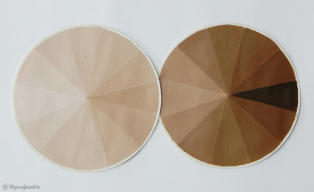
Skin tones are usually classified as Beiges and Browns. Any of us could be anywhere between Pale, Light Beige, Medium Beige, Dark Beige, Light Brown, Medium Brown or Dark Brown.
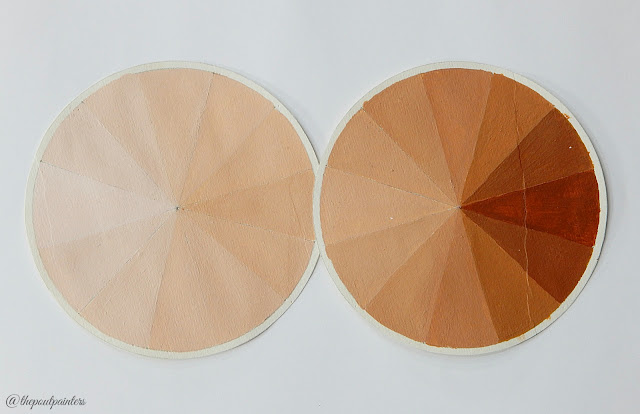 |
| Browns & Beiges (Have More Yellow) - Lighter Value Scale |
 |
| Browns & Beiges (Have More Blue) - Lighter Value Scale |
Let’s talk about Desi skin tones and eliminate the obviously wrong choices here. None of us Desis could be pale, if you think you are, chances are you are mistaking your light beige skin colour with pale. Similarly, none of us could be Dark Browns either, those are African skin tones. Desi skin tones usually span over Light Beige, Medium Beige and Light Brown (may be as well). Let’s put it in a simpler way, we could be Light and Medium, neither Pale nor Dark.
Next are the undertones. Since our skin is a living breathing organ, the normal healthy undertone will vary anywhere within the living half of the colour wheel. What that means is, when it comes to undertones your choices are: yellow-green (olives), yellow, yellow-orange, orange, red-orange which in general terms are known as olives, yellow, yellow-peach, peach, peach-pink and pink (a form of red). Desi undertones are usually restricted within yellow and yellow-peach undertones. Pink, peach-pink undertones can also be spotted but I have yet to spot olives in Desi skin tones.
Is anyone one of you olive-toned? I’d love to hear in the comments below.
The moment you infiltrate your undertone with a hue from the non-living half of the colour wheel, it no longer can be used as a normal foundation shade.
Facial contours are shadows; shadows are non-living and cool-toned. That is why the best, actually original, contour shades are cooler than your skin tone. Add a bit of blue hue to your foundation shade and you get its cooler version which you can contour with. No matter how pale one is, I don’t see any point justifying the use of warm contour shades on anyone!
Have you noticed one thing, the two extremes to undertones choices are yellow and red. Add a bit of red hue to a yellow undertoned foundation, its undertone will shift towards yellow-peach. Add a bit more red hue, you get a peach undertone. As you keep adding red colour, the undertone will gradually shift from yellow to pink.
Demonstration With Paints
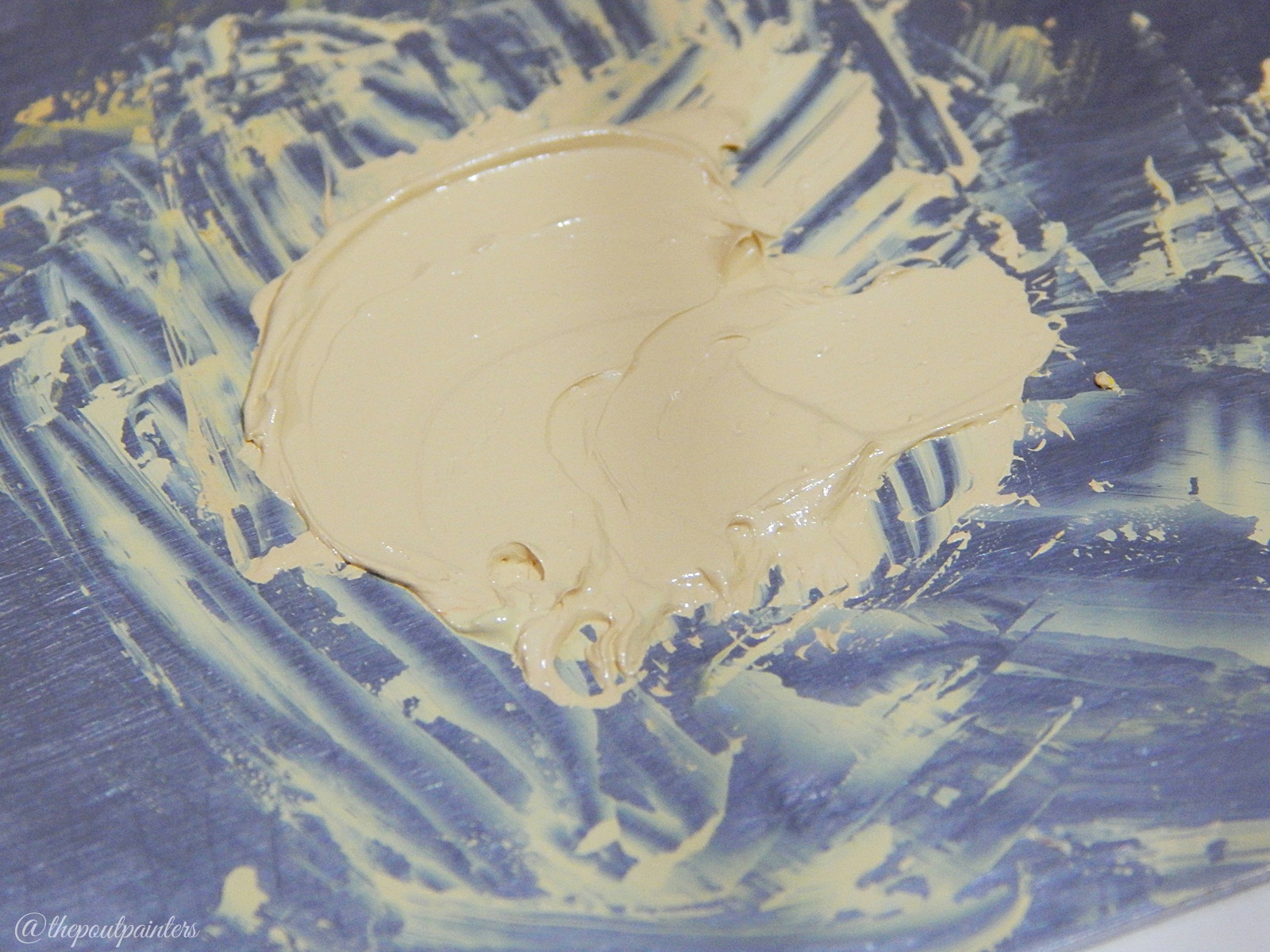
Just to demonstrate how the colours work together I am using acrylic paints here. Please note, acrylic paints dry darker than they normally appear while mixing. The material I have used are: Titanium White, Ultramarine Blue, Permanent Orange, Ivory Black, The Artiste Palette (which of course you can shop here :D).
Since Desi skin tones do not really cover Browns and Dark Browns in them I will not show how to darken a skin colour. I will be honest here too, I think darkening a colour while maintaining the undertone is way too difficult than going light.
Begin by taking out a small amount of yellow and white, this will increase the value of yellow since the yellow straight out of the tube is way too bright to work for any skin colour. Mix the two together and add a bit of orange (which has red in it!) to create a peachy shade. Next you need to add a bit of blue to complete the triad of primary colours since the peach colour on its own is very bright to suit any skin colour. Yes, we do have blue in our skin tones but not as much as zombies therefore a tiny bit of blue is what you need. From here I really just played with the colours, added white to increase the value where I needed, added orange to give the colour a slight red undertone, yellow to change the undertone to yellow.
Please note adding white (or black for that matter to darken) to lighten a colour also takes away a bit of life from it, deadens it a bit. Therefore to restore the life, you will need to add a bit of yellow.
You can apply the same mixing and manipulation method to primary colours used in makeup products as well. You will add white as per your skin tone's lightness and red/yellow depending on the undertone. If you are more neutral, you will need to arrive at a balance between red and yellow. It's all about experimenting, mixing and seeing the colours transform in front of you. You will waste a lot of product in the procedure that is why I chose to practice and demonstrate as well with paints.
Sources: Color by Betty Edwards, Internet, a bit of Youtube and buckets of wasted paint.
Do let me know in the comments below if you found this post helpful and if you have any more requests.
Love,
Fizzah
Disclaimer: This is a personal blog edited by its owners and the opinions expressed here belong solely to its owner's. For questions and queries please email at thepoutpainter@gmail.com